Graphic Design + Art Direction
A New Era: Westlake School for the Performing Arts Reimagined
Roles
Graphic Designer
Overview
After moving to the Bay Area for school in 2016, I built a close relationship with the local dance studio that gave me a home to practice my craft. This ultimately lead to Westlake School for the Performing Arts or "WSPA" contacting me to rebrand their business for the first time in 30 years.
01.
Understanding the Legacy
The Culture and Tradition
With Westlake School for the Performing Arts serving the Bay Area community for over 30 years, I knew It was going to be a difficult, but rewarding process. I wanted to translate years of legacy, dedication, and prestige into a refreshing and modern identity.
Throughout the span of 3 months, I was in constant communication with the founding members and acting directors of WSPA, really honing in on what defined them and their success for the past 30 years. The forefront of the success being, their 4 Pillars and Operating Principles.
Pillars
Education
Care
Community
Humility
Operating Principles
Aim for Excellence
Prioritize the Journey
Trust in You & Us
Strive Together
Stay Humble
Original Logo (Est. 1991)
02.
Logo Exploration
Initial Logo Kit
After understanding what type of culture and mission WSPA had, I went through countless iterations of one of the main asks:
a suite of unique logos that scaled across all of their assets, digital and print.
Approved Logo Suite
Following countless revisions and meetings, we settled on a solid suite of logos that were unique, legible, and most importantly, followed necessary characteristics shared by the studio owners:
Inclusive
Pride
Timeless
Unique
Inviting
03.
Typography + Color
Typography
For the typography, the goal was to utilize fonts that had versatility, legibility, and uniqueness. To achieve this, I curated 3 varying fonts that paired well together in different use cases.
Bicyclette was chosen as the main font due its clean and soft characteristics and most importantly, its large font family.
Saltery and Quirk were chosen as secondary fonts for their playful, welcoming, and decorative qualities.
Color Palette
When deciding on a color palette, the same thought process applied from the typography. A very versatile and welcoming palette was key here.
Another thing that was mentioned to me by the founders was that Teal has been apart of WSPA since they opened their doors. The tricky part, however, was that they never solidified what specific shade or tone would be utilized.
Over the 30 years, the teal motif was apparent, but never the consistency in HEX or Pantone. Finding a strong teal color and supporting palette was my goal.
04.
Expanding the Identity
Photo Treatment
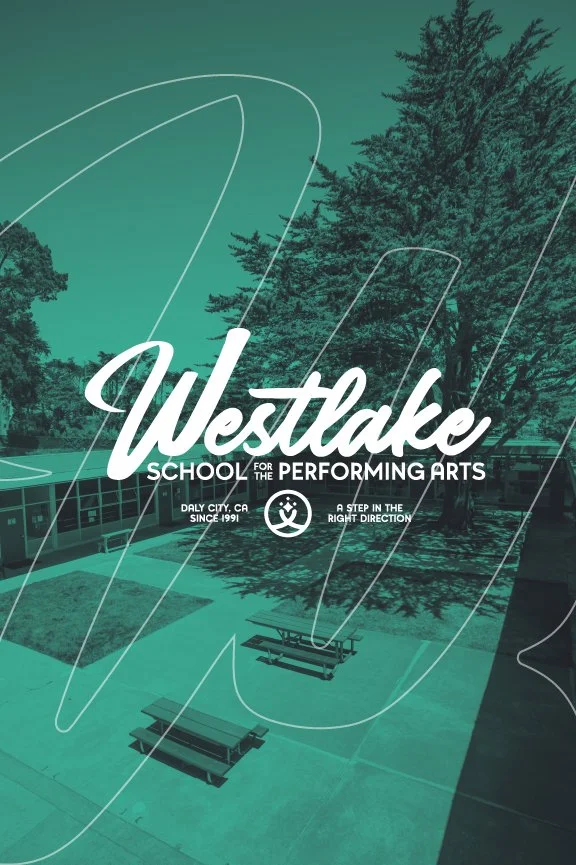
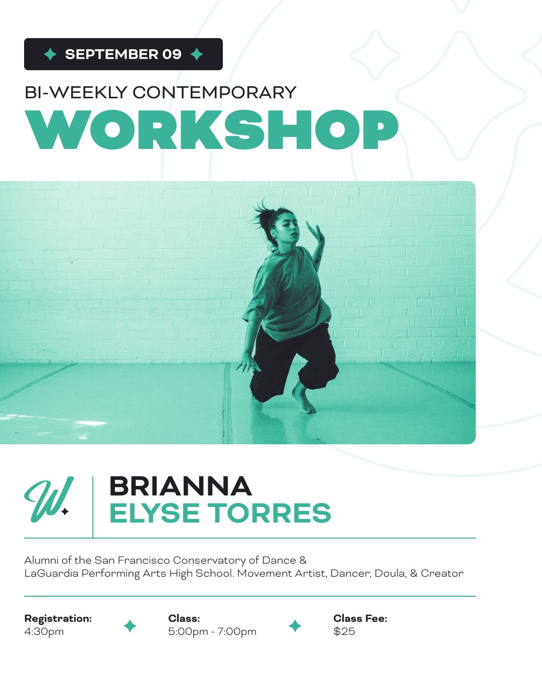
To aid the rest of the branding elements, I wanted to come up with another way to portray cohesiveness throughout the business and its wide variety of assets. That way being, a consistent photo treatment through gradient maps and color grading.
05.
Brand in Action
06.
Conclusion
-
From this project, I gained so much knowledge, experience, and lifetime friendship. I took on this project not too long after graduating from San Francisco State University.
The good people at Westlake School for the Performing Arts took a chance on me as a young designer and I couldn’t be any more grateful. I lacked a lot of experience at the time, but they took the risk and allowed me grow exponentially.
Although I provided professional design services to them, they taught me, and continue to teach me, so many valuable life lessons as a creative and young adult.
-
This project concluded in October 2021, but I still act as their lead graphic designer ‘til this day! I continue to collaborate and design for WSPA and their growing community of talented creatives, constantly learning and elevating the brand to the best of my ability.
Me visiting WSPA after the installation of their new signage (Circa 2023)
Other Work
Product Design
Tempo: The Comprehensive Mobile Dance Education App
Product Design
Transforming Full Swing Golf’s Online Presence


